How to Build a Consistent Visual Identity That Clients Remember

Your visual identity is more than just design—it’s the first impression clients have of your business. In the luxury space especially, consistent colors, typography, and imagery aren’t simply about looking polished, they signal professionalism, build trust, and make your brand instantly recognizable. When done right, your visual identity turns casual viewers into loyal clients who remember you every time.
When you operate in the luxury space, your brand isn’t just a logo – it’s a promise. A consistent visual identity helps your brand become instantly recognizable and fosters trust and loyalty among high‑end clients. Inconsistent branding, on the other hand, confuses prospects and can dilute your message. Here’s how to build a cohesive visual identity that your clients will remember.
Why Consistency Matters
- Improves recognition and trust. Branding consistency means using the same design and messaging elements every time you present your business. A potential client needs multiple impressions to remember your brand, and those impressions must be consistent to be effective.
- Prevents confusion. When prospects see your logo in different colors or fonts, they question whether they’ve found the right company.
- Builds familiarity and credibility. People are more likely to choose a brand they recognize, and consistent visuals create a sense of familiarity and trust.

Steps to a Memorable Visual Identity
Develop a Cohesive Brand Guide
A brand guide collects your logo files, color codes, typography guidelines and voice standards in one place. This ensures everyone—from your internal team to external partners—uses the same assets and tone. Include examples of how to combine the logo with your tagline (also known as a “lock‑up”) and set up templates for presentations, social media posts, proposals and other collateral.
Choose Your Core Visual Elements
- Logo and Logotype: Stick to a single logo or wordmark and typeset it consistently.
- Color Palette: Select a primary and secondary palette and use them across all touchpoints. For luxury brands, neutral tones with a refined accent color convey elegance. ATRIUM’s palette, for example, uses rich dark brown (#262018), light neutrals (#F2F0EB), and soft metallic accents (#A69886) with muted gold (#735E38) and cool gray (#80898C).
- Typography: Limit yourself to a couple of typefaces and use them consistently in print and digital media.
- Imagery: Decide on a photographic style that matches your brand (e.g., cinematic renderings, fine‑art inspired photography) and use it throughout your website, presentations and social channels.
Establish Voice and Tone
Visual identity goes hand‑in‑hand with messaging. Define a clear voice—formal or informal, modern or classic—and stick with it. Establish grammar rules (such as title vs. sentence case and Oxford comma usage) and standardize the way you write your company and product names.
Maintain Consistency Across Platforms
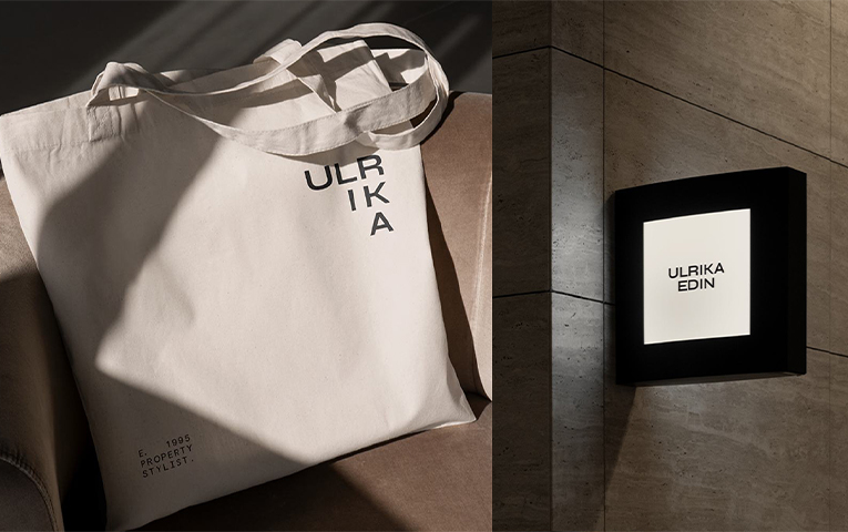
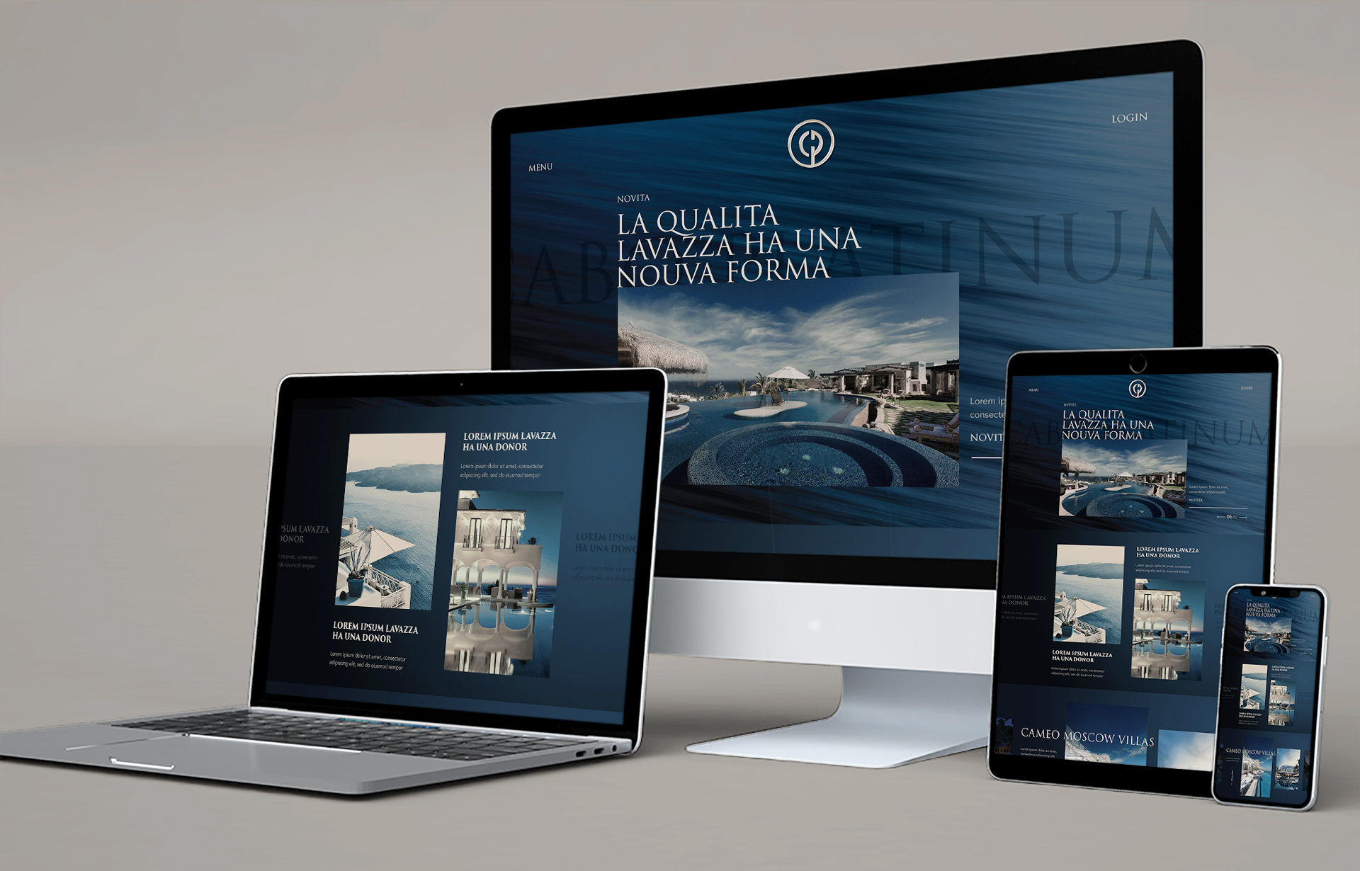
Consistency must extend beyond your website to all branded touchpoints—business cards, proposals, social posts, email templates and advertising. Create templates for frequent assets like social media posts and proposals so that your visuals always align. Share your brand guide with partners, contractors and marketing agencies to keep them on the same page.
Keep Evolving, But Stay Recognizable
Refreshing your brand doesn’t mean starting over. You can modernize your visuals while preserving the core elements that clients recognize. As your business grows, update your brand guide to reflect new offerings and ensure your visuals stay aligned with your evolving strategy.
Consistency doesn’t happen by accident. Start by creating your brand guide and share it with everyone who touches your brand. When every piece of communication—from renderings to proposals—looks and sounds like you, your clients will remember you for all the right reasons.


