Ulrika Edin Property Stylist
From House to Home — A Curated Brand & Website Built Like a Fine Art Collection



From House to Home — A Curated Brand & Website Built Like a Fine Art Collection
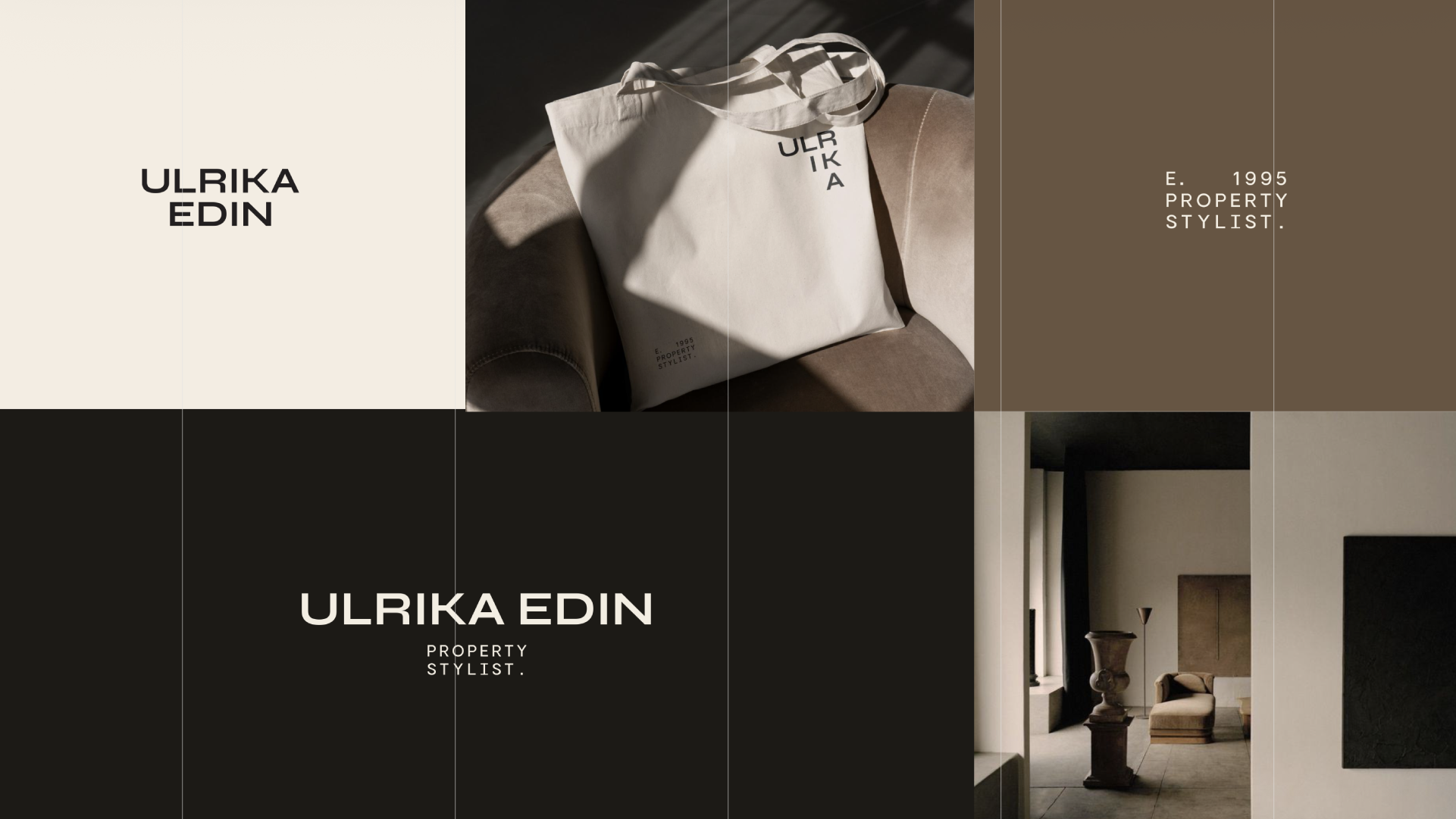
From House to Home — A Curated Brand & Website Built Like a Fine Art Collection
Ulrika Edin is a property stylist, remodel lead, and project manager serving California’s North Bay. She offers the whole package—design, permits, remodeling, and styling—under one roof so clients don’t have to make a thousand decisions or juggle vendors. She wanted a brand and website that matched that seamless experience and reflected her mission and values: personalized, functional, and stunning homes with stress-free, end-to-end project management.
From her intake, we learned her core mix (approx.): 70% remodels, 15% interiors, 15% styling, and a client base of middle- to high-income homeowners 35+ in the North Bay—busy families who want a turnkey transformation from “house to home.” She also asked for a logo that emphasizes “PROPERTY STYLIST,” with a symbol that nods to hands-on craft (e.g., a nail) and room for service descriptors (Design · Remodel · Styling).
Website goals: help visitors learn her services, showcase work, promote the brand, and support a compact page architecture (Home, About, Contact + Services/Portfolio/Testimonials as needed) in a modern, organic, minimal aesthetic.
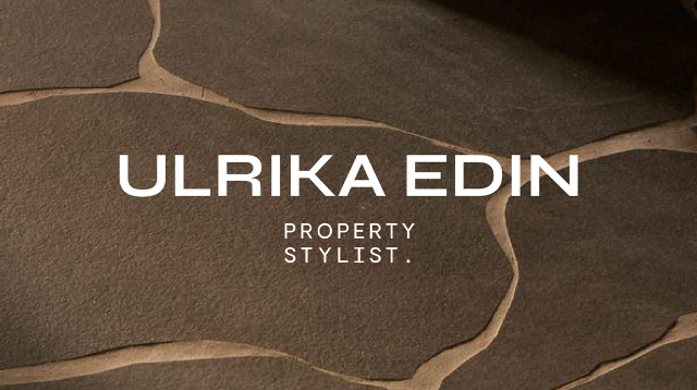
At ATRIUM, every engagement is treated like a commissioned artwork—bespoke, never templated. Andrea shaped the strategic foundation; Diego ensured the system would perform (clarity of offers, intuitive flows, SEO-ready structure, and lead capture). This is the Atrium Principle in action: strategy, artistry, and marketing brought into one aligned space.
1. Strategic Foundation
2. Editorial Visual Identity
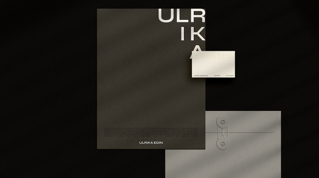
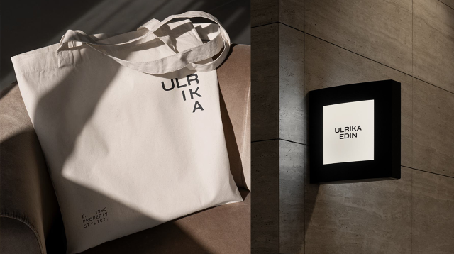
3. Branded Collateral & Sales Tools
4. Website Redesign (Curated Like a Gallery)
Ulrika is highly hands-on and quality-driven. To keep decisions clear without slowing momentum, we used a phased route process—moodboards → three logo/color routes → refinements—mapped to your standard timeline (brief, proposals, kickoff, creative session, adjustments, guidelines, brand folder).
“From House to Home isn’t just a tagline anymore—it’s how clients experience our process, start to finish”
— Ulrika Edin Property Stylist
Curated, not mass-market: Every touchpoint feels intentional and consistent with her full-service promise.
Art + Strategy in harmony: Editorial aesthetics and clear flows reduce overwhelm and move projects forward.
White-glove clarity: Templates and asset libraries save time in consults and keep the experience elevated without added effort.
Branding
Website
Andrea (Strategic Vision): curated the identity and site like a limited-edition collection—every element intentional, consistent, and on-brand.
Diego (Performance Precision): ensured the system works in the wild—clear offers, intuitive flows, and assets that support real-world selling.
Transformation, not just deliverables: the brand and website now help Ulrika communicate with impact, streamline approvals, and move projects forward.
L’AGENCE is no longer just a brokerage — it’s a signature, collector-worthy experience that signals trust, sophistication, and care from the very first interaction.
Client: Ulrika Edin Property Stylist (North Bay, CA)
Scope: Bespoke rebrand + website redesign (modern, organic, minimal)
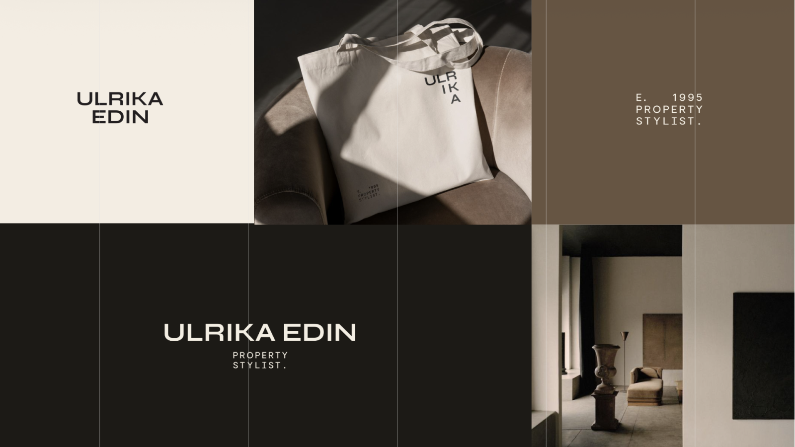
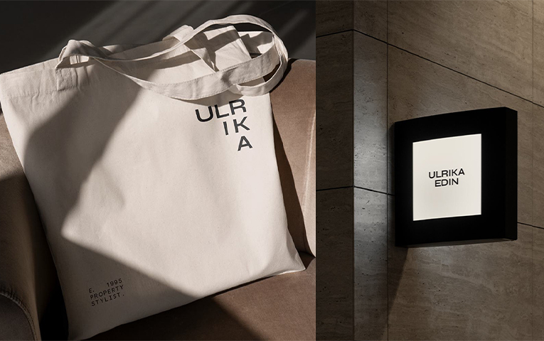
What we built: Logo system highlighting PROPERTY STYLIST; color/type; collateral & printables; signage concepts; brand book; modern site (Home, About, Contact + Services/ Portfolio/ Testimonials); conversion-ready flows; photography direction.
Why it works: Curated, seamless identity and site that mirror her “From House to Home” promise and full-service delivery.
“From House to Home isn’t just a tagline anymore—it’s how clients experience our process, start to finish”
— Ulrika Edin Property Stylist
Serving clients worldwide from our studio in Mexico